Okojo Pro + Slab Stack families

Price:
USD $25.00 (instant download)
Designers:
Ian Lynam
Publisher:
Wordshape
Categories:
Fonts

Try Me


Once upon a time, a young man with scribbles on his face rapped the words, “Stacks on stacks on stacks”. Prophetic. Engaging. And more than anything―*interesting*!

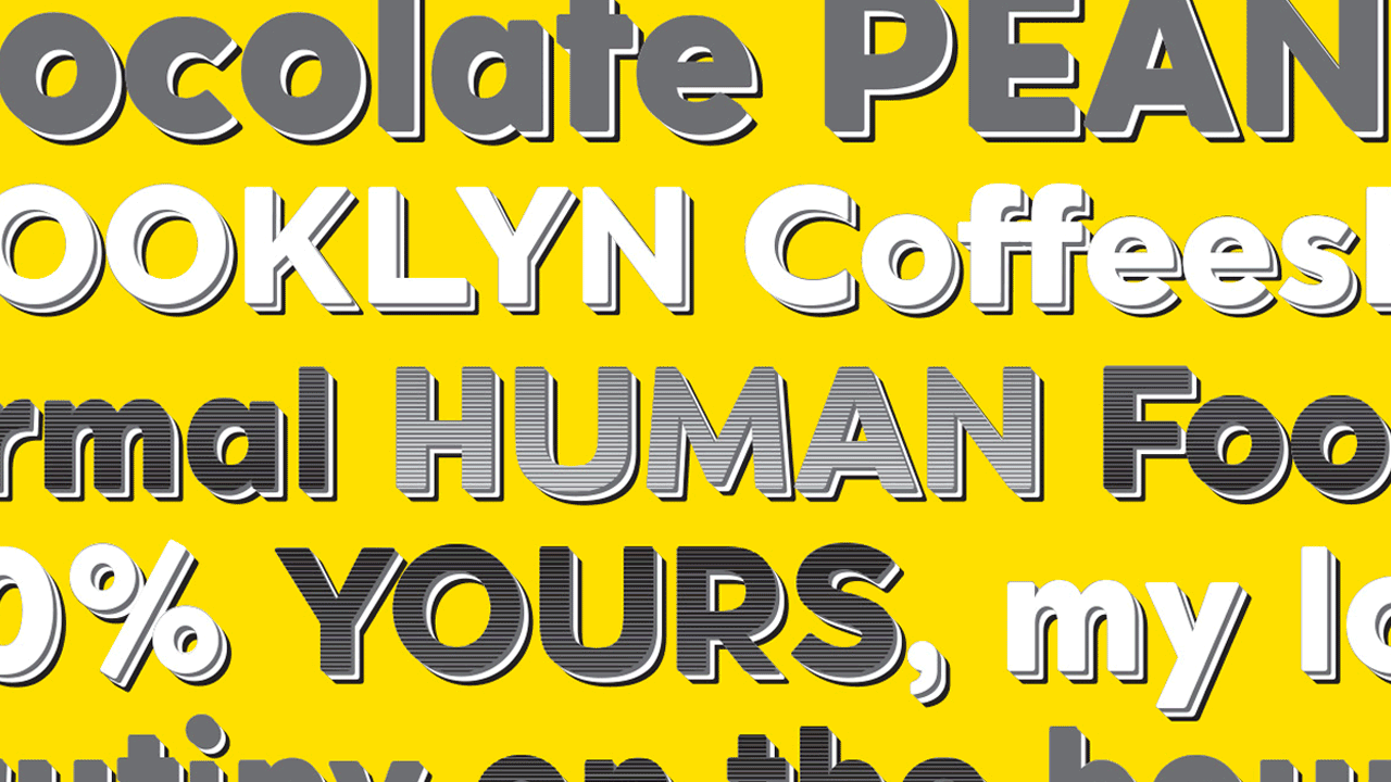
OkojoPro Stack is a family of six stackable typefaces: three layers of extrusion, a solid face, and two ornamental stepped layers―Sunset and Sunrise.

Add to Cart

OkojoPro Slab Stack is another family of six stackable typefaces: three layers of extrusion, a solid face, and two ornamental stepped layers—yup, also named Sunset and Sunrise.

All 12 fonts are provided in a Wordshape-only exclusive deal that is half the price of our distributors.

You can use the different type faces together to create ornamental headline typography with thousands of different possible combinations. Bonus: The face layer is a rugged bold typeface that has been spaced and kerned for text typesetting.

Combine these two families with the Okojo Pro Family of typefaces to create exquisite, eye-catching layouts for print or screen.

Okojo Pro Stack and Okojo Pro Slab Stack: Stack ’em up!

Add to Cart

All Wordshape typefaces are provided in desktop OpenType (.otf), TrueType (.ttf) and web font (.eot, .ttf, .woff, .woff2) formats and will be included in your immediately downloaded .zip file.

You can download fully functional demo fonts with a full character set here:

Download demo fonts


You Might Also Like:

Vaud Pro

Ten years after its initial release, we’re debuting Vaud Pro, our completely redrawn and reengineered version of our type family Vaud. Vaud Pro includes heaps more language support including Vietnamese, a select few tasty alternates, and so much more! Like socks!!!

BlkOut

BlkOut is a booming 3-cut display type family combining Regular, Display and Rough variations! BlkOut is a result of three things: the need for a distinctive ultra-black display typeface, an admiration for slab-serifs and Clarendons, and the love of systematic stencil type.

Interno

Interno is a stylish headline typeface duo inspired by a Walter Ballmer Olivetti logo exploration drawn sometime in 1960. Eli Carrico and Ian Lynam picked up where Ballmer left off, resulting in Interno One and Interno Two!

Entendre Display Variable

Entendre Display Variable is a stately, commanding and handsome sans serif typeface family squeezed into 2 regular and italic variable fonts that pulls reference from Trajan capitals, the history of English calligraphy, and a variety of other sources to summon a sense of warmth, consideration, trust and authority.

Entendre Display

Entendre Display is a stately, commanding and handsome sans serif typeface family that pulls reference from Trajan capitals, the history of English calligraphy, and a variety of other sources to summon a sense of warmth, consideration, trust and authority.

Entendre Variable

Entendre Variable is a distinguished, attention-getting and warm sans serif typeface family of 22 weights and cuts squeezed into 2 variable fonts that pulls reference from the original Roman fonts, the history of British handwriting, and a variety of other sources to summon a sense of friendliness, thoughtfulness, authenticity and consideration.