Cruller

Price:
USD $20.00 (immediate download)
Designers:
Ian Lynam
Publisher:
Wordshape
Categories:
Fonts

Try Me


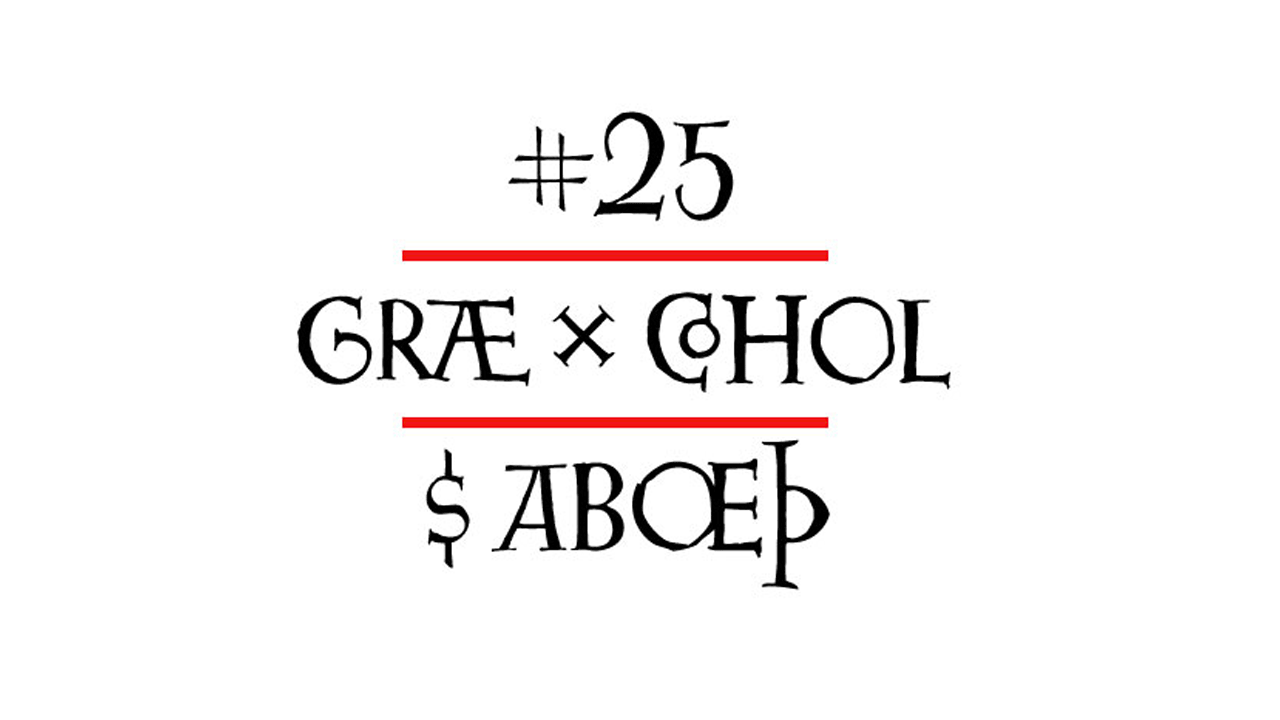
Cruller is a display typeface that is based on a rare bit of lettering from a 1910 German lettering book. Used perennially for assorted metal bands’ logos, it is a spidery bit of lettering that would work well in Harry Potter movies or on album covers.

Add to Cart

Usage recommendations:
Display type for use in materials that are meant to have a hand-wrought look circa the turn of the century.

Download includes OpenType and TrueType formats.

Add to Cart


You Might Also Like:

Cern

Cern is a family of 40 weights of neutral, yet formally nuanced grotesk typefaces that takes inspiration from Helvetica, Akzidenz Grotesk, Univers and the original metal types from Switzerland, yet has a slightly larger x-height for more pronounced legibility.

Onick

Originally commissioned by Onitsuka Tiger, Onick is back!
(Also, it's free.)

Glot Round

Glot Round is a ten-member flared terminal sans serif family of typefaces based on a mix of proportions of Roman square capitals and hyper-readable sans serifs.

Glot

Glot is a ten-member flared terminal sans serif family of typefaces based on a mix of proportions of Roman square capitals and hyper-readable sans serifs.

Kirimomi Display

Kirimomi Display is a six-member family of typefaces for text typesetting and design for screens.

Biwa & Biwa Display

Biwa is a 14-member straight-sided family of formally nuanced grotesk typefaces. Biwa’s lighter weights feel subdued, cool in tone, and neutral, while the heavier weights are more robust and full of personality.